From Plastic Bags to Premium Brands
If you’ve been around cannabis long enough, you remember when packaging meant a simple ziplock bag. A scribbled strain name, a quick weigh, and you were on your way. Those days are firmly behind us. Today’s Montana dispensaries are packaging art, science, and marketing savvy into every jar, pouch, and box that hits the shelf.
Modern cannabis branding is no longer an afterthought. It has become a critical part of the experience. Strong brands focus on telling a story, using clean and intentional design, reflecting local identity, and signaling authenticity at a glance. In a state that values craftsmanship, independence, and grit, minimalism blends naturally with mountain culture in a way that feels honest and earned rather than manufactured.
Design That Feels Like Montana
The strongest Montana cannabis brands do not try to look like California or Colorado, and that distinction matters. Instead of loud colors and trend-driven visuals, they lean into earth tones, mountain motifs, restrained color palettes, and clean, readable fonts. The emphasis is on transparency and restraint rather than spectacle.
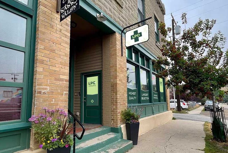
You will not find neon graphics or cartoon mascots dominating the shelves. What you see instead are natural aesthetics, quiet confidence, and honest storytelling that reflects the place these products come from. Lone Peak Cannabis reflects that same philosophy through design that is grounded, approachable, and clearly rooted in Montana’s wild beauty and outdoor ethos.
The Science of Shelf Appeal
Good branding does more than look appealing. It builds trust before a customer ever opens the package. Clear labeling, legible typography, and prominently displayed test results reassure buyers that what is inside the container matches what is promised on the outside.
Montana consumers tend to care more about quality and integrity than gimmicks. That is why modern dispensaries invest in practical details such as QR codes for lab results, tamper-evident seals, child-resistant closures, and eco-conscious materials. These elements quietly communicate professionalism and accountability, building confidence at first glance without needing bold claims.
Less Flash, More Substance
The era of novelty-driven “stoner branding” is fading quickly. In its place is a more mature and thoughtful approach to cannabis design, one that prioritizes function, clarity, and long-term brand trust. This evolution mirrors the customers themselves, who are informed, discerning, and more interested in consistency than hype.
In Montana, cannabis branding is growing up, and that shift is a positive one. The future belongs to brands that respect the product, the consumer, and the place they call home.